
Catalog

Accordion

Crowdfunding

Icons

Homepage

The homepage is the central hub that sets the tone for your entire web presence. It is designed to be visually appealing and highly functional, featuring a well-organized layout that highlights your most important content.

Header

The ‘Header’ component is versatile module designed to improve the usability and branding of the top section of your site. This component includes elements such as the site logo, navigation menu, search bar and optional call to action buttons.

Footer

The ‘Footer’ component is a comprehensive and customisable module designed to improve the navigability and functionality of the bottom section of your site. This component includes areas for essential information such as contact details, social media links and quick links to important pages.

Navigation

The ‘Navigation’ UX/UI component is a module designed to improve the overall usability and accessibility of your site. This component includes a customisable navigation menu with options for drop-down menus and responsive design to ensure smooth navigation on all devices. Improving the user experience by providing clear and organised access to the main sections and content of the site.

Accessibility

The ‘Accessibility’ feature offers tools to adjust text, add alternative descriptions to images and improve the structure of content, making navigation more intuitive. This feature ensures that your site meets accessibility standards and provides an inclusive and effective experience on all devices.

Contact Forms

The ‘Contact Forms’ component is a module designed to facilitate communication between your visitors and your organisation. This component includes customisable form fields, validation rules and CAPTCHA for spam prevention, ensuring efficient handling of queries and comments.

Feature list

The ‘Feature List’ UX/UI component is a dynamic and visually appealing module designed to highlight the key features and benefits of your products or services. This component includes customisable list items with icons, descriptions and optional links to detailed pages.

Glossary

The ‘Glossary’ UX/UI component is an informative module, designed to provide definitions, explanations of key terms and concepts. This component includes an alphabetical index, search functionality and tooltips for easy access to term definitions. It improves user understanding and engagement by providing clear and concise information.

Highlights

The ‘Highlights’ component is a visually striking and dynamic module designed to draw attention to key content or advertisements. This component includes customisable highlight blocks with options for images, text, call-to-action buttons and animations.

Maps

The ‘Maps’ component is a versatile and interactive module, designed to provide geographic information and enhance location-based content. This component includes customisable map styles, markers and information windows.

Pages

The ‘Pages’ are sections dedicated to displaying content with attractive and functional layouts. This section of the website provides a variety of uses and examples of visually appealing and well-structured pages. Each page shows how to implement effective design, offering practical guidance for building content that is both aesthetically pleasing and easy to navigate.

Stock market

The ‘Stock Market’ UX/UI component is a dynamic real-time module designed to display up-to-date stock market information. This component includes customisable stock tickers and market summaries, providing users with accurate and timely financial data.

Storytelling

The ‘Storytelling’ component is a creative and immersive module, designed to enhance narrative content. This component includes features such as scrolling, multimedia integration and customisable layouts to create engaging and interactive stories.

System page

The ‘System Page’ component is a module designed to improve the user experience on system-generated pages, such as 404 error pages. This component includes customisable messages, search bars and navigation links to guide users back to relevant content. Ensuring a consistent and friendly experience even on error pages.

Team

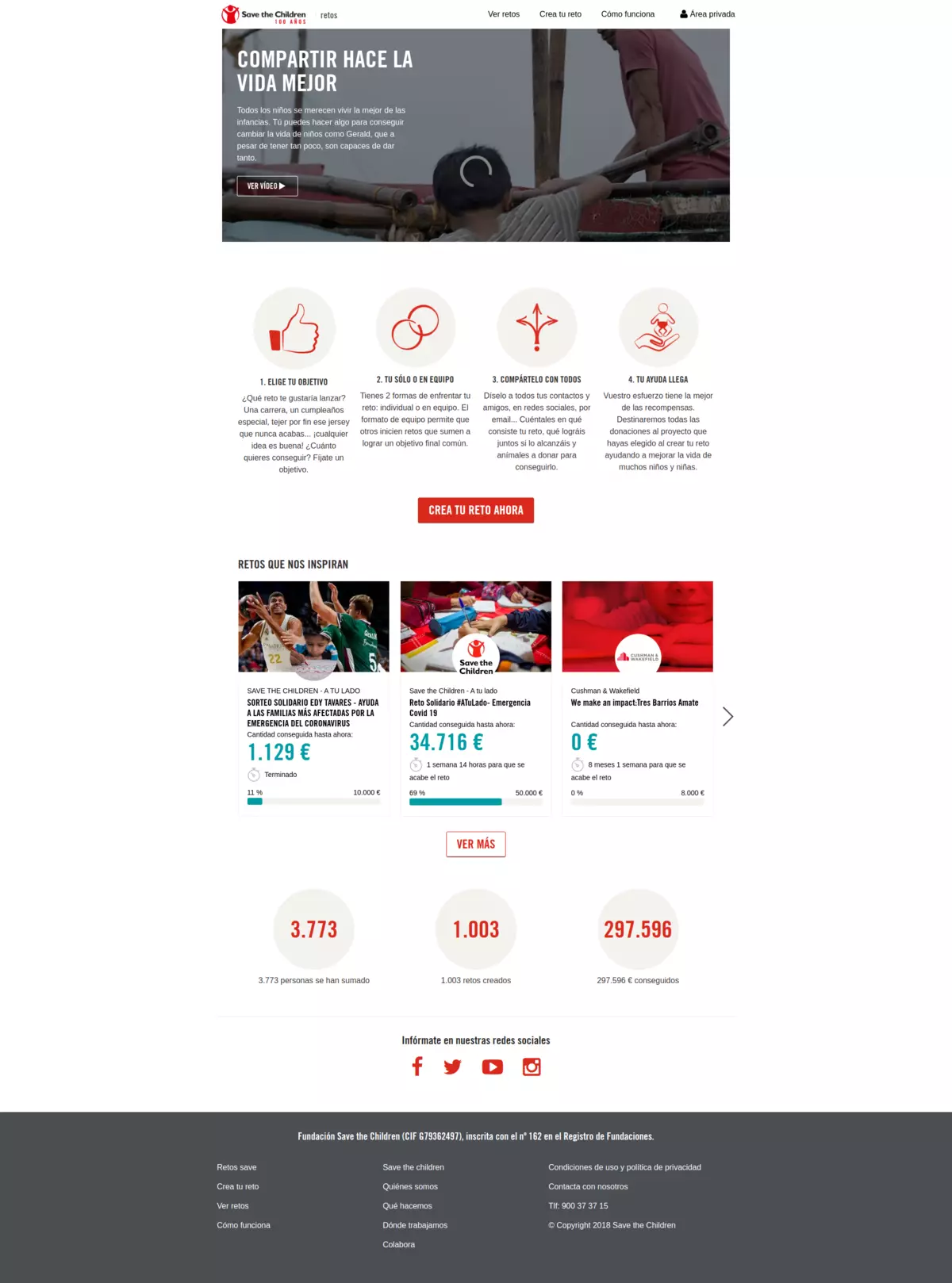
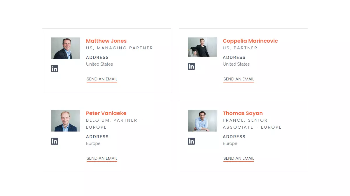
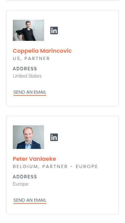
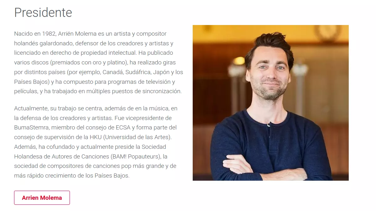
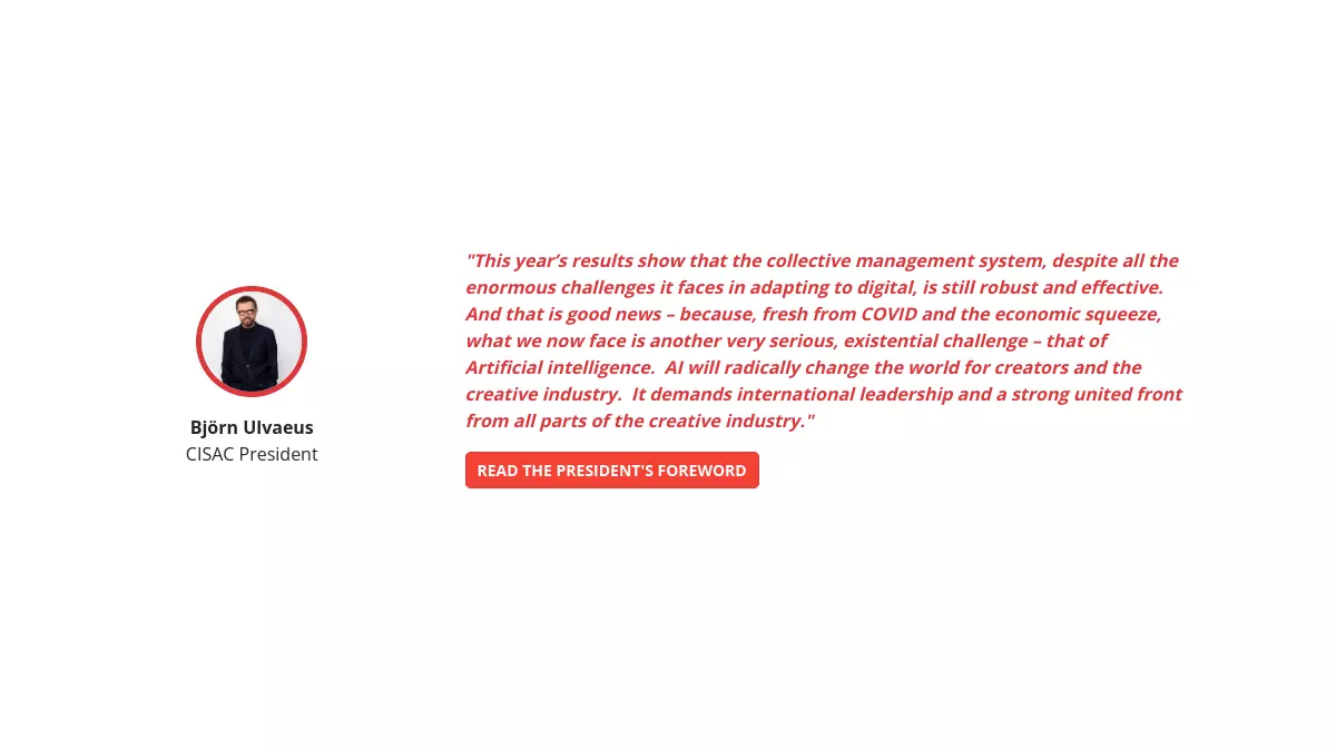
The "Team Members and Board" UX/UI component is a dynamic, visually appealing module designed to showcase your organization's key personnel. This component features a grid or list layout with profile cards for each team member or board member. Each card includes a photo, name, title, and a brief bio, with optional links to detailed profiles or social media.

Membership

The ‘Membership’ component is a comprehensive module, designed to manage user memberships and subscriptions. This component includes features such as membership registration forms, profile management and payment integration.

Events

The "Events" UX/UI component is a dynamic, engaging module designed to manage and display events. This component includes features such as event calendars, registration forms, and event detail pages.

Campaign

The ‘Campaign’ component is a versatile and eye-catching module. This component includes features such as campaign landing pages, progress bars and call to action buttons.

Listings

The ‘Listings’ category offers various design options that allow you to display information in a clear and effective way. With it, you can present cards, videos or well-structured content, providing your users with an intuitive and organised browsing experience. This component improves the accessibility and visual impact of your data and resources, facilitating an attractive and functional display on your website.

Hero

The ‘Hero’ component is a module designed to capture the attention of users with prominent images and messages. This component includes customisable banners with options for images, videos, text overlays and call-to-action buttons.

Contact

The ‘Contact’ component presents essential information such as names, e-mail addresses and telephone numbers in a visual and customisable card format. It facilitates access to contact details in a clear and attractive way, enhancing the user experience when interacting with the information.

CTA

The ‘Call to Action’ (CTA) component is a compelling and impactful module designed to drive user engagement and conversions. This component includes customisable buttons, banners and pop-ups with clear, eye-catching messages.

Documents

The "Documents" component is a module designed to manage and display documents. This component includes features such as document upload, categorization, and search functionality, making it easy for users to find and access relevant documents.

Donations

The ‘Donations’ component is a powerful and intuitive module designed to facilitate online donations. This component includes features such as customisable donation forms, payment integration and donor management tools. It is fully responsive and adaptable, providing a smooth and secure donation process across all devices.

Featured

The Featured component is designed to highlight content with visually striking designs. This component helps to showcase key elements or promotions on your site, ensuring they stand out and effectively engage your audience.

Gallery

The "Gallery" component site is a versatile, engaging module designed to showcase images and multimedia content. This component includes features such as customizable gallery layouts and slideshow options.

Header banner

The ‘Header Banner’ component is a visually striking and impactful module designed to capture the attention of users with prominent images and messages. This component includes customisable banners with options for images, videos, text overlays and call-to-action buttons.

Content Menu

The ‘Content Menu’ component provides a structured navigation menu that displays the headings and subheadings of your site's content. It allows users to easily navigate between sections and pages directly from the current page, enhancing the user experience by providing quick and intuitive access to relevant information.

Media and text

The "Media and Text" component is a dynamic, engaging module designed to integrate multimedia content with textual information. This component includes customizable layouts for combining images, videos, and text in a visually appealing manner.

Testimonial

The ‘Testimonials’ component is a compelling module, designed to display comments and opinions. This component includes customisable testimonial blocks with options for images, text and ratings.

Search

The "Web Search" UX/UI component is a powerful, intuitive module designed to enhance the user experience by providing efficient and accurate search capabilities. This component includes a search bar with auto-suggest functionality, filters, and sorting options to help users quickly find the information they need.

Sidebar

The ‘Sidebar’ component is a versatile and customisable module designed to improve the usability and organisation of sections of your site. This component includes areas for widgets, quick links and additional navigation options.

Timeline

The ‘Timeline’ component is designed to display chronological information in a visually appealing way. This component includes customisable timeline layouts with options for images, text and links to detailed pages.